At Zipperfield, I served as the lead developer and product manager for the creation of the Honeybis website.
Honeybis is a CBD infused honey start-up based in Philadelphia. You can view the live website here. Read on to learn about my role as the project manager and the choices I made in the design process.
As project manager...
As project manager, I took on many responsibilities. First, I pursued, pitched, and acquired the client. Then, I scoped and formalized a contract. In the contract, I detailed the project's deliverables and time frame. Throughout the duration of the project, I served as the point person between the client, a logo designer, and my team at Zipperfield. Finally, I built out the custom design on top of a WordPress website.
I applied the lessons I learned in previous projects to the Honeybis contract. Since website creation is made up of many moving parts, it is important to have all parties in agreement about the work to be done. A clear contract leads to a website closer to the client's vision. The contract also sets guidelines for any major changes that the client might want.
Through previous projects, I learned the importance of using the simplest tool for the job. It is easier to make changes to the website design in our design tool Figma, then it is to make changes to the website design directly in the code. I based our contract and design process in this framework. The process attempted to establish the content and functionality of the website before its design; and establish the design before the code.
The Design Process
For the Honeybis website, I orchestrated a multi-stage design process, which provided continuous checkpoints and clarity to the client.
For the first part of the design process, my business partner and I designed a low-fidelity wireframe. A low-fidelity wireframe is a simple, black and white design focused on communicating the content and functionality of the website.
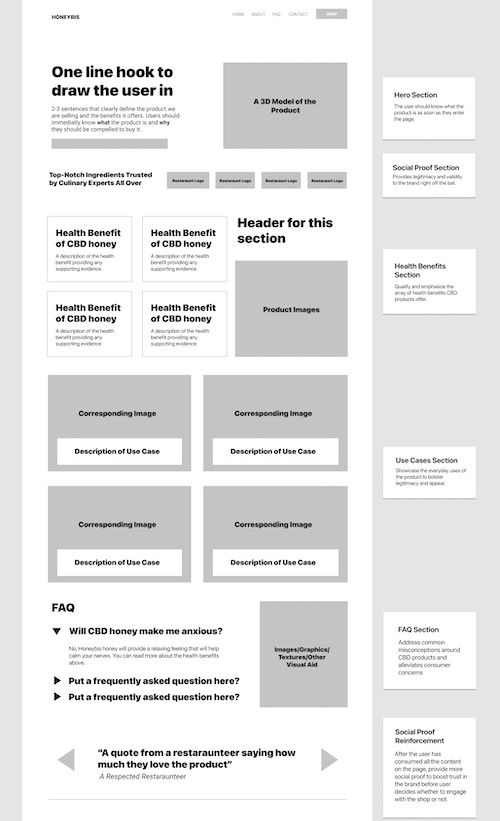
The Honeybis Low-fidelity wireframe
We approached the low-fidelity wireframe with a strength/weakness framework. How could we highlight the product's top three features? How could we address the user's top three concerns?
Next, my business partner designed three "heroes" to establish the website's "design language."
A design language is the overarching guide to the style of the website. It is made up of the colors, typography, and attitude of the website.
A "hero" is the first part a user sees when visiting a website. From the hero, the user learns why the website exists and then decides whether to continue to explore it. The importance of the hero in first impressions makes it a great choice as a way to communicate the website's design language.
In preliminary branding discussions, the client asked for a design with a black background and gold text, and a sleek feel similar to Apple. Designing and presenting three heroes allowed my business partner to design both in the client's vision and a separate time with complete creative license. A techy black background is atypical for food branding so my business partner also created a design with a light background and bright text. Presenting multiple design options to the client allows the client to feel confident in their final decision.
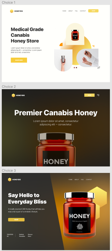
Three choices in hero design
After the client signed off on the low-fidelity wireframe and chose their preferred hero, my business partner got to work on finalizing the final design.
While my business partner was busy at work, I story-boarded the animation. In initial conversations with the client, I pitched a 3D animation similar to Apple's iPhone or AirPod websites. The animation would be central to the hero of the webpage. While I was thankful the pitch secured the contract, I still had to figure out how to actually build the animation!
I have worked in Cinema 4D before, but I did not want the animation to become a time-absorbing personal learning project. Instead, I prototyped a video with my iPhone camera and storyboarded the animation in Figma. These visuals served as clear communication to a 3D designer.
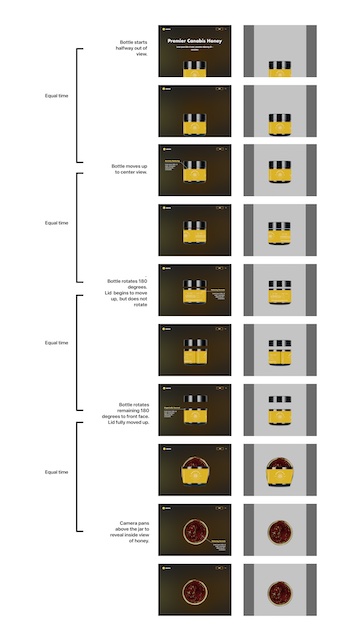
Honeybis animation storyboard
Once the designer completed the animated video, I converted it into an optimized animation for the web. I used the Bodymovin plug-in for After Effects, which turns an image sequence into a Lottie animation. Lottie is an open source file format that creates "tiny, high quality, and interactive" animations for the web.
Responsive web design is about considering every user, not just every screen size. To meet the needs of the user with a slow internet connection, I optimized the video's file size to quicken website load times. Also, I added a backup photo with a much smaller file size so any user can experience the website regardless if the animation loads.
Overall, my biggest takeaways for this project were the skills I developed as a project manager rather than the techniques I learned about web development. Thanks for reading!
