An Evolving Side Project
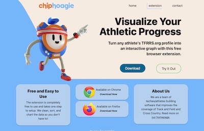
I ran track in college and now, for fun, I have been working on a data analytics website that covers the sport. The current state of this project is a browser extension that makes it easier to view an athlete's performances on the primary track database website Tfrrs.org. You can view the landing page for the extension here.
The project started in a different place then where it is now. As the project shifted, I developed a clearer sense of my interests and began to focus on web development. I also learned about building projects for people versus building a project to learn. Read on to find out more.
Motivation and Context
I ran track and cross-country for the Pomona-Pitzer Sagehens. Athletics was a large part of my college experience and I have made lifelong friends from the team.
Cross-country running consists of eight kilometer (five mile) races across different terrains and venues. While times in track are easily compared because athletes compete on similar sites, times in cross-country are difficult to compare because every course is vastly different. For example, an athlete may run a minute faster on a flat golf course as opposed to a hilly trail for the same five mile race.
My original project goal was to create a tool to compare athletes' performances on varying courses. If athletes were easily comparable, I could create rankings and predictions for future races, which would fill a void in the media coverage of the sport.
The Dataset
My data set includes nearly one thousand different courses, over 6,500 races, about 300,000 athletes, and over one million individual performances. In this article, I will spare you the details of data collection and data cleaning (In short, the process was time consuming and meticulous). After collecting the data, I started by exploring it.
In college sports, there are five divisions of athletics. Each division has its own championship and its own unofficial level of competitiveness. One of my early questions was, "how often do teams from different divisions compete against each other?" My worry was that siloed divisions may make it difficult to normalize times.
To answer this question, I made a data visualization. I used the Google Maps API to add addresses, latitudes, and longitudes for each college into my data set. Then, I created a Shiny app that visualizes the competitive relationship between the network of colleges. You can view this prototype below:
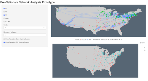
Launch Network Analysis Shiny App
This Shiny app demonstrates that colleges mostly compete within their own division. However, it also shows that many colleges compete outside of their division several times a year, which could be enough to compare their results.
Once I had a good understanding of the data, I began a literature review on different methods that researchers used to approach similar problems. I found a paper that looked promising.
Applying a Statistics Paper to my Data Set
I found a paper titled, "A stochastic rank ordered logit model for rating multi-competitor games and sports" by Glickman and Hennessy. In the paper, the authors detail how the US Olympic Committee hired them to estimate the strength of different women’s Alpine downhill skiing athletes. What stood out to me was that instead of using time to score athletes, the authors used order of finishes. This method seemed promising in a sport like cross-country where times are highly variable.
I implemented the Newton Raphson algorithm described in the paper in R to use on my own data set. You can view the unpolished code for this algorithm on my Github.
The size of my data set required me to optimize and parallelize the algorithm and run the code on a high compute Google Cloud server. At first, the algorithm looked promising on a small test data set of cross-country data. Unfortunately, when I scaled the algorithm to the complete data set the results were nearly meaningless.
I suspect the algorithm did not work on my data set because of the extreme variability of college cross-country running. Olympic level downhill skiing results are more consistent than cross-country running because of the difference in the length of the races (a race takes a few minutes rather than about 25 minutes), and the variability in strength of athletes (one college athlete can be more than ten minutes faster than another).
I decided to restart and approach the problem from a simpler perspective.
Starting Over with a Simpler Approach
My new naive approach to comparing times between two courses was to collect all the results from each course and compare their performance distribution. To clarify, a cross-country course is the location of a race like a golf course, trail, park, or farm.
As an example, I would collect as many results as I could from two courses and then look at the time that qualified as the same percentile on each course. The 98th percentile may be 25 minutes on a fast course, while the 98th percentile on a slow course may be 26 minutes, which would indicate a 60 second conversion between these two courses.
One of the reasons I liked this idea is I thought the concept would be easy to communicate to users without a math background - especially with an interactive data visualization.
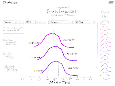
Here is a mockup I created of a data visualization for my new idea. I had yet to learn Figma!
I pulled a sample set of data for four courses and created a prototype in Shiny, an R package that makes it easy to build interactive web apps straight from R. In the prototype seen below, you can enter a time in seconds for a performance on the Pomona-Pitzer home course and then the app will convert that time to the percentile on each of the available courses.
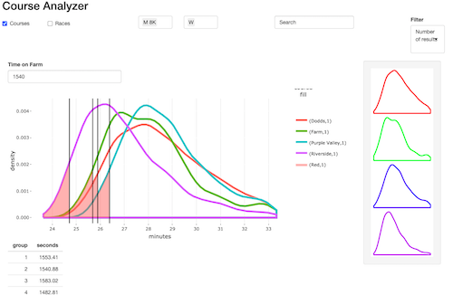
Launch Shiny App
I used this prototype to get feedback from my college teammates on the idea. My teammates were excited about the idea so I began to think about scaling the project.
I quickly realized that Shiny would not cut it for the features and capabilities I wanted. With little idea of how to build my own web app, I began the Odin Project, an open source web development curriculum.
Beat to the Finish Line
The rabbit hole of learning and experimenting was a long one. As I was busy learning, someone else released a website doing the same thing I wanted to do! This slowed down my motivation for working on the project.
Fortunately, I now had a solid understanding of the Web and a newfound interest in building websites. Along the way, I discovered Hacker News and began reading more about start-ups and product development. I also started a web development company with my business partner Eli and developed my skills.
From my own experience, I learned the difference between creating something as a learning project, versus creating something to be useful. In retrospect, Shiny would have been a great way to launch and scale my project. By getting something out fast and seeking more feedback from users from the start, I could build a stronger and more useful product.
Lacing up for Another Attempt
I re-approached my project after a break. My new goal? Quickly making something that people can use.
I pivoted my project to the browser extension featured in the first paragraph of this post. I knocked the extension and the landing page out in a week and launched it! The extension has more than 20 users on Chrome, which feels like a great start.
With everything I learned, I am excited to continue to build things. In the future, I will clarify my goals before I start. I also would like to try building in public. I want to practice writing and communicating my progress along the way to become a stronger communicator and to get more feedback.
Thanks for reading!
